
Godot Popups
Popups are useful in Godot for simple alerts, dialogs, forms to get input from the user, menus, and file-system access.
They are normally hidden until one of the popup methods is called to open the popup. Then, the popup automatically closes in response to user input, or the use of the hide() method.
We may use a Timer to trigger the closing of the popup some time after it opens.
We can connect the popup_hide() signal to our main script to take action when the popup is closed.
Opening Mode
If we use the show() method to make the popup visible, we may click outside it to interact with other controls and the popup stays visible.
If we use one of the popup() methods, the popup is opened in modal mode. This means that it will close if we click outside it.
There is also a property called popup_exclusive. If we set this on a modal popup, it will have to be closed by using its close button, or by code. Also, other controls in the scene will be unresponsive (they cannot get focus) until the popup is closed.
The Popup Class
The Popup class provides the basic behavior to position a Popup window in the center of the screen or within rectangular bounds.
Using this Node directly, it is like a simple Control Node (but a popup) to use as the parent of other Nodes.
It emits signals for just before opening and when it is hidden.
PopupMenu
This is used to display a list of items for menus.
Tip: use the MenuButton Class if you are creating a drop-down menu because it saves you the need to make the PopupMenu a child of a ToolButton, and it supports Acellerators (shortcut keyboard actions).
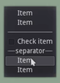
Items are added in code such as text labels, icons, radio buttons, and separator lines. When an item is clicked, a signal is emitted. The hide_on_item_selection property determines if the popup is hidden after the click.
PopupDialog
This displays a dark gray rectangle background by default, but this may be changed in the Custom Styles in the Inspector.

The panel does not resize to enclose its child control nodes. In this case, the child node is a TextureRect.
Panel Customization
To get a more game-like appearance for the popup, the Panel setting may have a style applied to it such as StyleBoxFlat. You may also use textures.
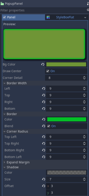
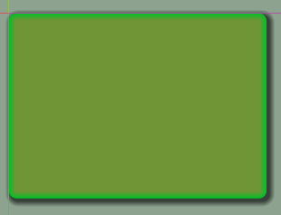
The background panel now looks like this:
PopupPanel
This displays a dark gray panel background by default which may also be restyled. Unlike the PopupDialog, the panel resizes to enclose its child control nodes.

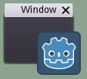
WindowDialog
This is the base class for familiar-looking popups with a top bar displaying a Title and a Close button.
You need to add child Nodes to it for content and manually adjust its size to enclose the content.
The get_close_button() method allows for accessing the Close button such as for hiding it with get_close_button().hide().
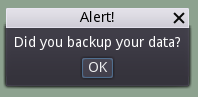
AcceptDialog
This dialog inherits from the WindowDialog and is useful for small notifications to the user about an event. It has a text area for entering Dialog text, and displays an OK button to close the window.
When the OK button is pressed, the confirmed signal is emitted.
The window title is “Alert!” by default.
This Dialog expands in size to contain its content within a margin container.
An AcceptDialog containing child node content but no dialog text.
If we replace the content with control nodes that take up less space, the window will not shrink. To get around this, we set the size of the window to zero so that it will expand after the new content is added. set_size(Vector2.ZERO)
ConfirmationDialog
This dialog inherits from AcceptDialog and also shows a Cancel button alongside the OK button.
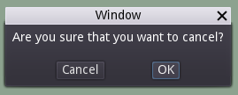
Here you can see some highlighting of the control (OK button) that has focus. This behaviour can be disabled in the Focus property settings.
It has a get_cancel() method to get a reference to the Cancel button. Then you can access the signals of the button such as pressed to connect to it with code to handle a user wanting to cancel. However, it’s best to ignore this and respond to the confirmed signal instead. So if a user cancels, there is no signal emitted and the window just closes.
FileDialog
This is used to choose files and directories in the file system. Before opening, you set the mode to how you want to use the window. And, you may also set the current file path. When the window is closed, it emits a file_selected signal with the path to the selected file or directory.
Here is a code snippet example for handling the signal:
func _on_FileDialog_file_selected(path: String):
   # Check if a file was selected
   if path.rstrip("/") == path.get_base_dir():
   	$Alert.dialog_text = "No filename was specified"
   	$Alert.popup_centered()
   	return
   file_name = path
   if action == SAVE: # A state variable is checked
   	save_data()
   else:
   	load_data()
Edge Cases
Edge cases are where we get unexpected behavior that could break things if they are not addressed. One of these is that it is possible for a user to drag a non-modal window outside the viewport and then there is no way to close the window because the X or OK buttons are not in the viewport anymore. But, the popup window content remains visible.
To get around this, you may connect the mouse_exited signal to a function that checks if this situation has occurred and act accordingly. Here is some code to do that:
func _on_your_panel_mouse_exited():
	# Hide if dragged outside of screen
	if !get_viewport_rect().encloses(Rect2(rect_position, rect_size)):
		hide()
Here is a YouTube video about Popups
This is not my video, just one I found interesting.
More solutions
- Godot Keyboard and Mouse Button Input Programming
- Godot Event Handling
- Signals in Godot
- How to Save and Load Godot Game Data
- Godot Timing Tutorial
- Using Anchor Positioning in Godot
- UI Layout using Containers in Godot
- Shaders in Godot
- Godot State Machine
- Godot Behaviour Tree
- Parsing XML Data
- Godot Parallax Background
- How to Make a Godot Plugin
- Godot Regex - Regular Expressions
- Random Numbers
- Coroutines, Await and Yield
- GraphNode and GraphEdit Tutorial